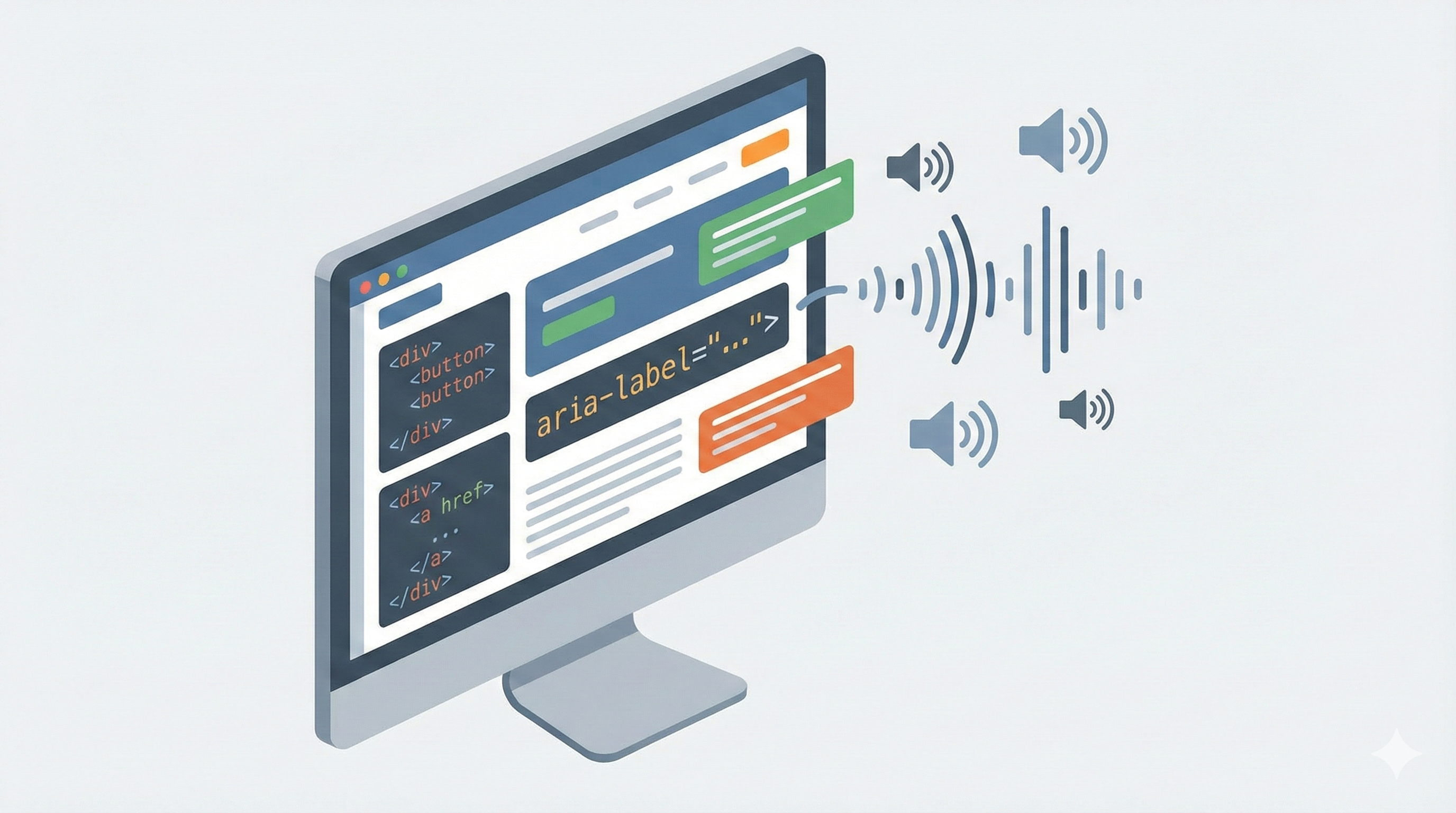
What is the aria-label attribute really for, when should it be used and especially when should it be avoided? Misunderstood, it can affect the accessibility of a web page. When used properly, it greatly improves the experience for users of screen readers and assistive technologies.
Aria-label: quickly understand the essentials
The attribute aria-label is part of the ARIA specification, Accessible Rich Internet Applications. It allows you to add a text description to an HTML element when this text is not visible on the screen. This information is for screen readers and assistive technologies, not visual users.
Concretely, aria-label gives an accessible name to an element. This name is read aloud by the screen reader to help the user understand the role and function of this button, link, or other interactive element. On the modern web, where interfaces are increasingly visual, this attribute plays a key role in accessibility.
It is important to understand that aria-label does not replace native HTML. It comes as a complement, when the visible content is not enough to describe the element clearly for all users.
The role of aria-label in web accessibility
Web accessibility aims to make a page usable by everyone, including people using a screen reader, keyboard navigation, or other assistive technologies. In this context, aria-label acts as a bridge between code and user experience.
When a screen reader analyzes a page, it relies on the HTML structure, tags, attributes, and ARIA roles to render information. If a button contains only one icon or if a link is represented by an image without text, the screen reader has nothing relevant to read without aria-label.
Thanks to this attribute, the user immediately understands the possible action. This improves navigation, reduces errors, and makes the interface truly accessible. It is also a point that is often checked during an accessibility audit.
What is the purpose of aria-label on a web page in concrete terms
On a web page, aria-label is used to make sense to elements that don't have any visually. This is common in modern interfaces where icons, minimalist buttons or interactive grids are preferred.
Let's take a button with a magnifying glass icon. Visually, the information is clear. For a screen reader, this element is often read as an unnamed button. By adding aria-label with a description like Search, you provide clear and understandable text.
The same principle applies to links represented by an image, to action buttons in a grid, or to custom navigation elements. The aria-label attribute improves the understanding of content without changing the appearance of the page.
When to use aria-label and when to avoid it
Aria-label should only be used when native HTML is not enough. If an element already contains clear visible text, it is useless and sometimes harmful to add aria-label. Assistive technology always favors native content when it exists.
It is relevant to use aria-label for a button without text, an iconographic link, a clickable image or a form field without a visible label. In these cases, the attribute provides essential information to the user.
On the other hand, on a button with readable text or an explicit link, aria-label can create confusion if it is different from the visible text. The user experience becomes inconsistent between the screen and the screen reader. Accessibility is based on consistency and simplicity.
Aria-label, label, title and aria-labelledby: making a difference
The HTML label is the priority solution for form fields. It is visible, accessible, and understood natively by screen readers. Aria-label should never be used to replace a real label when it is possible to display one.
Aria-Labelledby allows you to link an element to other text already present on the page. This is often a better option than aria-label because the text is shared and consistent for all users.
The title attribute, on the other hand, is not reliable for accessibility. It is poorly supported by screen readers and should not be used as the sole source of information. In an accessible approach, aria-label and aria-labelledby are much more relevant.
Well used aria-label code examples
In the HTML code, aria-label is added directly to the tag in question. On an iconographic button, it allows you to describe the action without adding visible text. On a link represented by an image, it specifies the destination or purpose of the link.
The attribute can also be used on a div or a span when they have an interactive role, for example with JavaScript. In this case, it is essential to also add a suitable ARIA role so that assistive technologies understand the state and function of the element.
A good aria-label is short, to the point, and action-oriented. It describes what the item does, not how it looks. This improves reading by screen readers and the overall understanding of the interface.
Navigation, regions, and complex components
In rich interfaces, aria-label is often used to name navigation regions, sections, or functional areas. A nav tag can thus be associated with a clear description to help the user find their way around the page.
Components such as tabs, pull-down menus, or interactive grids require special attention. Aria-label can complement ARIA roles and state attributes to make these elements accessible. The aim is to allow smooth navigation, even without viewing the screen.
Good structuring of regions and sections also improves the overall experience, especially on long pages or complex web interfaces.
Aria-label and Webflow: what you need to know
In Webflow, it is possible to add aria-label directly to many elements such as buttons, links or images. It's a simple way to improve accessibility without writing a lot of code.
However, there are some limitations. Not all ARIA attributes are always accessible from the interface. For advanced components, custom code may be required to properly manage roles, states, and relationships between items.
In a professional Webflow project, aria-label must be part of a global accessibility strategy, consistent with the HTML structure, navigation and real content of the page.
Test and validate the use of aria-label
Testing aria-label is not limited to checking its presence in the code. You also have to listen to the real rendering with a screen reader. What seems logical in the code can be confusing when spoken.
Accessibility audit tools help identify items with no accessible names or inconsistent descriptions. Manual verification is still essential to ensure a good user experience.
An accessible page is a page that is tested, understood, and continuously improved. Aria-label is a powerful tool, but it must be used methodically and with understanding.
Going further on web accessibility
Aria-label is often the first ARIA attribute you discover, but it's not everything. A true accessibility approach is based on a clean HTML structure, clear content, logical navigation and a thorough understanding of user needs.
At Scroll, we support companies in the design and the optimization of accessible, efficient and sustainable websites, especially on Webflow. Accessibility is not a technical constraint, it is a lever for user experience, compliance and overall quality of the web project.
Faq
Aria-label is an ARIA attribute that allows you to provide a textual description to an HTML element when no visible text is present. This information is read by screen readers in order to improve accessibility for assistive technology users.
The HTML label is a priority and recommended when it is possible to display it, especially for form fields. Aria-label serves as an alternative solution when the visible label is not present or is not visually relevant.
Yes, Webflow allows you to add the aria-label attribute on many elements such as buttons, links, images or sections. For more advanced needs, custom code may be required to manage ARIA roles and states.


.svg)


.svg)
.svg)
.svg)